Chapter 5 Enhanced Influence Model
After having a primary look at the network constructed using our simulated data, we moved on to use the Enhanced Influence Model to identify significant subnetworks within the graph that shed light on genetic causal pathways, which takes into consideration both the significance of individual genes with respect to the disease as well as the network topology.
5.1 Graph Diffusion Kernel
We computed the graph diffusion kernel as the first step to apply the Enhanced Influence Model, which measure the extent of mutual interaction between genes in our network. Note that the obtained graph diffusion kernel is solely dependent on our network structure.
The idea of graph diffusion kernels bears resemblance to random walks from a source. Here we imagine that the importance of nodes flows along edges. Initially, query nodes are selected to serve as sources where fluid is pumped in at a constant rate that flows along edges. In addition, we assume that fluid leaks out of each node at a constant rate \(\gamma\). Intuitively, large \(\gamma\) means faster rate of loss and therefore shorter diffusive paths.
At equilibrium, there is no net flow in the entire network. The more interaction a node has with the query nodes, the more fluid it will contain at the equilibrium (Qi et al., 2008). Following the procedure in previous literature (Vandin, Upfal, and Raphael, 2011), we set \(\gamma = 5\), which is approximately the average degree of a node in our network (See Chapter 3).
Mathematically, let \(u(t)\) denote the unit step function where \[u(t) = \begin{cases}0 \;\text{ if }\;t<0\\1 \;\text{ if }\;t>0 \end{cases}\]
\(b_i = 1\) if \(i\) is the source node of interest, and \(b_i = 0\) otherwise.
The amount of fluid contained by node \(i\) at time t is \(x_i(t)\) is governed by the flow in and out of it,
\[\frac{d}{dt}x_i(t) = \sum_j A_{ij}x_j(t)-\sum_jA_{ji}x_i(t)-\gamma x_i(t)\] As \(t\to \infty\), the fluid distribution approaches to its equilibrium distribution at which the influence of node \(i\) to other nodes is measured by \[L_\gamma^{-1}\vec{b_i}\] where \(\vec{b_i}\) is the standard basis with 1 at its \(i^{th}\) entry. Here, \(L_\gamma = S-A+\gamma I\) is the shifted graph Laplacian by \(\gamma\) where \(S\) is the diagonal matrix whose diagonal entries are the corresponding degrees. In practice, we normalize A symmetrically by \(S^{-\frac{1}{2}}AS^{-\frac{1}{2}}\) such that the edge weights between two nodes are normalized by the degrees and replace \(S\) correspondingly to obtain the Laplacian (Qi et al. 2008).
Here, the \(ij\) entry of \(L_\gamma^{-1}\) gives the influence of \(j\) on \(i\), which may or may not equal to the \(ji\) entry of \(L_\gamma^{-1}\). To better interpret the result, we define the mutual influence between i and j to be \(\tilde{i}(i,j) = \min(L_\gamma^{-1}[i,j],L_\gamma^{-1}[j,i])\) (Vandin, Upfal, and Raphael, 2011).
5.2 Enhanced Influence Model
Enhanced Influence Model is an efficient algorithm to identify a significantly mutated subnetwork with respect to gene interactions by incorporating considerations of both the topology of the network and significance of individual genes with respect to the disease (Vandin, Upfal, and Raphael, 2011). Below are the key procedures involved in the Enhanced Influence Model:
Recall from Chapter 4, marginal regression gives a p-value, \(p_i\) for each gene \(i\). We then assign a score \(\sigma_i\) to a gene \(i\) where \(\sigma_i = -2\log(p_i)\).
For each pair of genes (\(i\),\(j\)), their mutual interaction is measured by \(w(i,j) = \max(\sigma_i,\sigma_j)*\tilde{i}(i,j)\) (Vandin et al., 2011).
Next, we remove all edges with weights smaller than a threshold \(\delta\) to obtain a subgraph. In Section 5.3, we shall exhibit a method to determine this cold-edge threshold \(\delta\). The connected components remained are candidates for genetic pathways.
The code below shows how we construct the enhanced influence model from scratch.
# normalize A
A_normalized <- matrix(0,nrow(A),nrow(A))

for(i in 1:(nrow(A)-1)){
  for(j in i:nrow(A)){
    if(deg[i]!=0 && deg[j]!=0){
      A_normalized[i,j] <- A[i,j]/sqrt(deg[i]*deg[j])
    }
  }
}

A_normalized <- forceSymmetric(A_normalized,"U")
A_normalized <- as.matrix(A_normalized)

# normalize the corresponding degree matrix S
S_normalized <- diag(rowSums(A_normalized))

gamma <- 5
L_gamma <- S_normalized+diag(gamma,nrow(A))-A_normalized
inv_L_gamma <- solve(L_gamma)

# compute symmetric importance score using Enhanced Influence Model
W <- matrix(NA, nrow(A),ncol(A))
for(i in 1:(nrow(A)-1)){
  for(j in (i+1):nrow(A)){
    W[i,j] <- min(inv_L_gamma[i,j],inv_L_gamma[j,i])*max(mutations_score[i],mutations_score[j])
  }
}
# helper function to remove cold_edge
removeColdEdge <- function(mat,W,delta){
hotnet <- mat
for(i in 1:(nrow(A)-1)){
for(j in (i+1):nrow(A)){
if(W[i,j] < delta){
hotnet[i,j] <- 0
}
}
}
return(hotnet)
}# get the filtered network
Hotnet <- removeColdEdge(A_normalized,W,0.04)
Hotnet <- as.matrix(forceSymmetric(Hotnet,"U"))
colnames(Hotnet) <- position
rownames(Hotnet) <- position
# convert the adjacency matrix to an edge list
HotEdges <- melt(Hotnet) %>%
rename(Source = Var1, Target = Var2, Weight = value) %>%
mutate(Type = "Undirected") %>%
select(Source, Target, Type, Weight) %>%
filter(Weight != 0) %>%
select(-Weight)# helper function that returns the number of connected components of size >s
getNumComp <- function(edges,nodes,s){
edges.copy = edges
edges.copy = edges.copy%>%select(Source,Target)
colnames(edges.copy) = c("from","to")
g <- graph_from_data_frame(edges.copy, directed=FALSE, vertices=nodes)
clu <- components(g)
res <- groups(clu)
count <- 0
for(i in 1:length(res)){
if(length(res[[i]]) >= s){
count <- count+1
}
}
return(count)
}5.3 Determine Value for Cold-Edge Threshold \(\delta\)
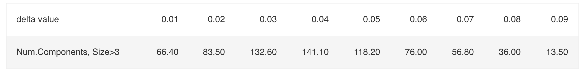
In this section, we illustrate a way to determine the value for \(\delta\). We start with simulating 50 datasets under the null hypothesis where no genetic pathway is related to the disease status by permuting observed disease status in order to preserve possible correlations between occurrences of mutations (Vandin et. al, 2012).Then, for a small value of \(s\), where often \(s \in \{3,4,5\}\), we choose the first \(\delta\) that gives the largest number of subnetworks of size at least \(s\). The value \(s\) is chosen such that under the null hypothesis the number of connected components found of size at least s is statistically significant. Given the size of our network, we use \(s = 3\). Table 5.1 report the number of connected components of size at least 3 as a function of \(\delta\).
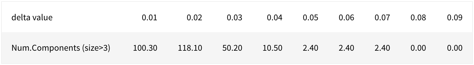
\[\text{Table 5.1: Number of Components with Size > 3 as a Function of} \;\delta\]
According to Vandin (2012), an empirical choice is using the first \(\delta\) that gives the maximum number of connected components of size at least 3, which gives \(\delta = 0.02\) in our case. Since increasing \(\delta\) gives us more conservative criteria, we also consider the following values: \(1.5\delta = 0.03, 2\delta = 0.04, 3\delta = 0.06, 4\delta = 0.08\). In fact, if \(\delta_1 >\delta_2\), then the connected components of size at least 3 obtained using \(\delta_2\) will be subnetworks of those obtained using \(\delta_1\).
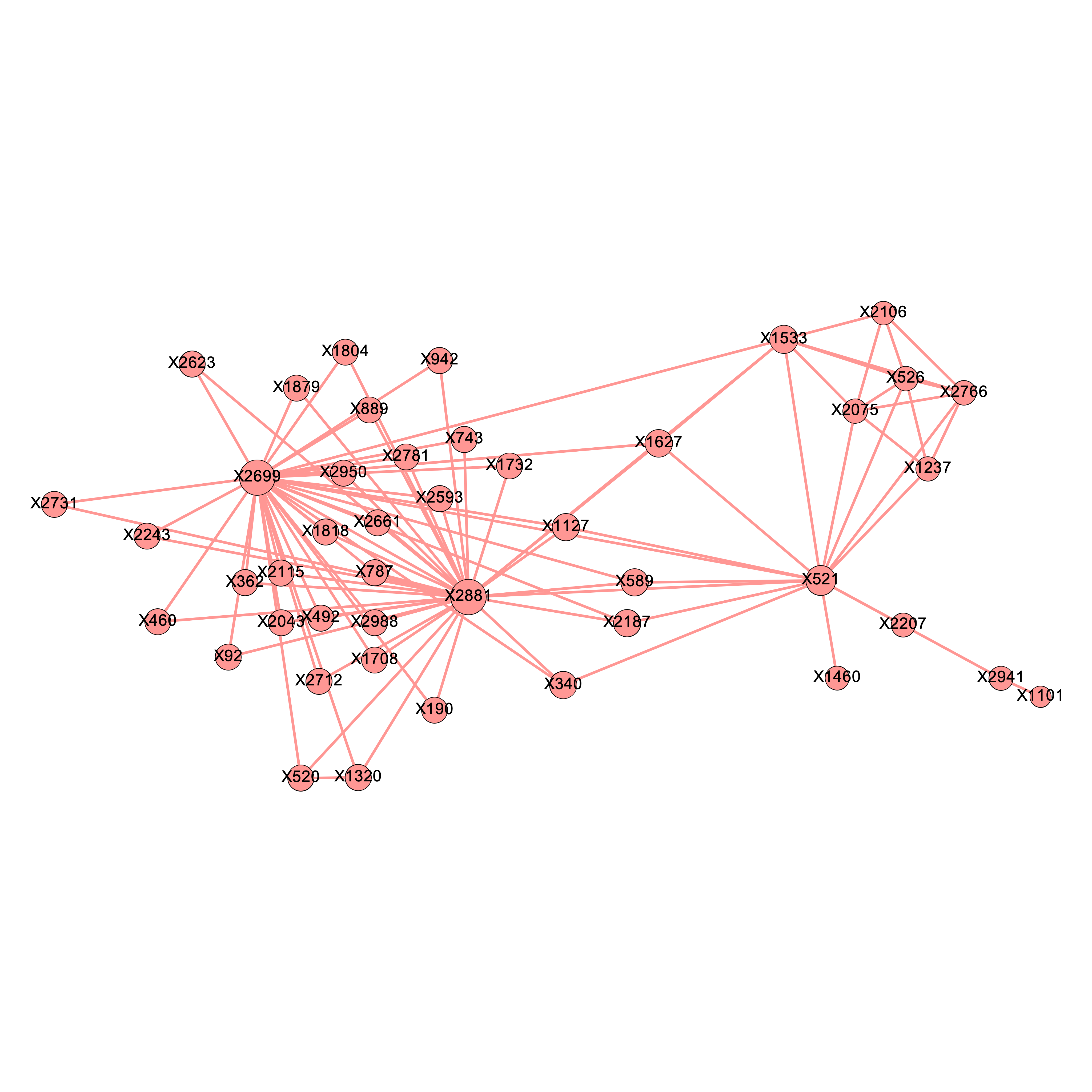
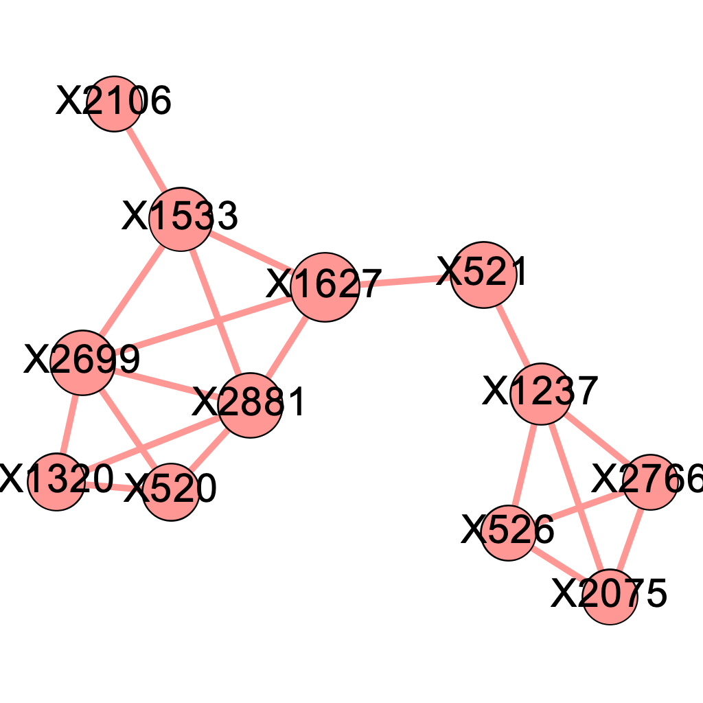
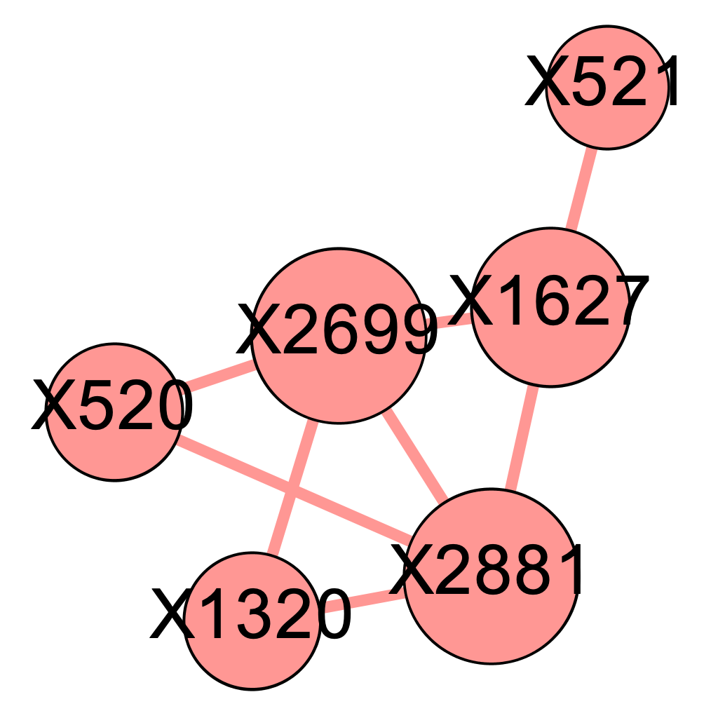
We applied the above \(\delta\) values to filter the edges and obtained 5 graphs using the graph presented in Chapter 4. Intuitively, as we raise the value for \(\delta\), there will be more isolated nodes and the size of major component will decrease as it gets decomposed into smaller parts. We expect the the true causal pathways will be among the connected components after applying the Enhanced Influence Model and filtering the edges. Figures 5.1 (a) - (e) shows their corresponding major components, which contained the 4 genetic causal pathways listed in Chapter 4. Nodes are sized by the closeness centrality throughout our analysis.
\[\text{Figure 5.1(a): Major component of the network of mutated genes when delta = 0.02}\]
\[\text{Figure 5.1(b): Major component of the network of mutated genes when delta = 0.03}\]
\[\text{Figure 5.1(c): Major component of the network of mutated genes when delta = 0.04}\]
\[\text{Figure 5.1(d): Major component of the network of mutated genes when delta = 0.06}\]
\[\text{Figure 5.1(e): Major component of the network of mutated genes when delta = 0.0}\]
We found that at \(\delta = 0.04\) and \(\delta= 0.06\), the major component both contains precisely the 12 SNP locations that were part of at least one pathway interaction combination. To determine which one of the two is better, we go back to the four original pathways and evaluate their quality. It seems that the major component more accurately describes the truth when \(\delta = 0.04\), as presented below.
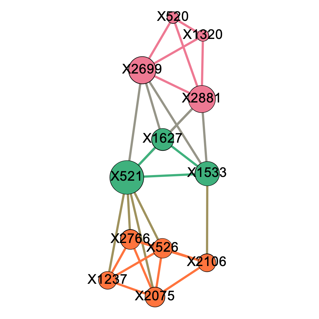
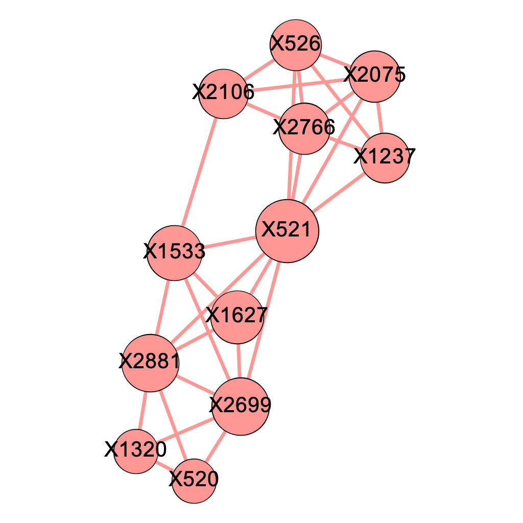
\[\text{Figure 5.2: Modularity Class Breakdown within the Major Component when delta = 0.04}\]
Figure 5.2 shows after modularity decomposition, our algorithm successfully captures most of the structures of the 4 pre-selected genetic pathways we listed in Chapter 4.2. The pink modularity class corresponds perfectly to the first pathway (X2699, X1320, X520, X2881); out of the 5 nodes classified in the orange modularity class, 4 of them come from the second pathway (X2766, X1237, X2075, X521, X526) and 4 from the third pathway (X526, X2766, X2106, X2075, X1533); the 3 nodes in the green modularity class are 3 of the 5 SNP locations from the fourth pathway (X2699, X521, X2881, X1533, X1627). Note that nodes with high closeness centralities such as X521, X1533, and X2699 happen to be those SNP locations shared by multiple pathways.
The fact that the fourth pathway captured by our algorithm appears to be most imperfect one might be explained by the fact that 3 of its components are shared with other pathways. As our algorithm obtains subgraphs by removing edges, we conjecture that shared SNP locations by multiple pathways makes the it hard for the algorithm to make a perfect division between pathways. To confirm our thought, we simulated 50 dataset under a simplified situation where no two pathways share a mutual SNP location and presented the results below.
We used the codes below to help determine an appropriate value for the threshold \(\delta\):
# generate 50 datasets under the null hypothesis
disease_status_mat <- matrix(NA,50,500)
for(i in 1:50){
  disease_status_mat[i,] <- permute(disease_status_vector)
}

# compute scores for each gene in the 50 datasets
pVal.lst <- list()
for(k in 1:50){
  res <- c()
  for (i in 1:length(position)){
    outcome <- "disease_status_mat[k,]"
    variable <- position[i]
    f <- as.formula(paste(outcome,
        paste(variable),
        sep = " ~ "))
    model <- lm(f, data = sub_data)
    res <- c(res,summary(model)$coefficient[,4][2])
    pVal.lst[[k]] = res
  }

}
score.lst = list()
for(k in 1:50){
  score.lst[[k]] = -2*log(pVal.lst[[k]])
}

# apply the Enhanced Influence Model to the 50 datasets
W.lst = list()

for(k in 1:50){
  W.lst[[k]] = matrix(NA, nrow(A),ncol(A))
  for(i in 1:(nrow(A)-1)){
    for(j in (i+1):nrow(A)){
      W.lst[[k]][i,j] = min(inv_L_gamma[i,j],inv_L_gamma[j,i])*max(score.lst[[k]][i],score.lst[[k]][j])
    }
  }
}

# a helper function that returns the average number of connected components
# of size greater than s under the null hypothesis using delta
aveNumComp_s <- function(delta, s=3){

  Hotnet.lst = list()
  for(k in 1:50){
    Hotnet.lst[[k]] = removeColdEdge(A_normalized,W.lst[[k]],delta)
    Hotnet.lst[[k]] = as.matrix(forceSymmetric(Hotnet.lst[[k]],"U"))
  }

  HotEdges.lst = list()
  for(k in 1:50){
    colnames(Hotnet.lst[[k]]) = position
    rownames(Hotnet.lst[[k]]) = position
    HotEdges.lst[[k]]= melt(Hotnet.lst[[k]]) %>%
      rename(Source = Var1, Target = Var2, Weight = value)%>%
      mutate(Type = "Undirected") %>%
      select(Source, Target, Type,Weight) %>%
      filter(Weight != 0)%>%select(-Weight)
  }

  numComp_s = rep(0,50)
  for(k in 1:50){
    numComp_s[k] = getNumComp(HotEdges.lst[[k]],nodes,s)

  }
  return(mean(numComp_s))
}5.4 Alternative Situation
In the previous section, we find that our method is confused about which modularity class a certain node belongs to. We hypothesize that this may be due to that the node makes up more than one combination of pathway interactions. We wonder if the problem will arise when each mutation only contributes to one pathway combination (denoted as Scenario B). If the problem universally happens, we need to analyze its cause.
We repeated the process, with a twist in the construction of the original dataset. We simulated a dataset where no two pathways share a SNP location. Random simulation gives the following 4 causal genetic pathways:
X2608, X182, X1443, X624, X2422
X2454, X1099, X350, X2548, X883
X31, X2725, X608, X471
X815, X2108, X2494, X2812, X1245
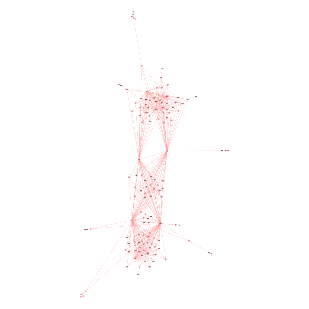
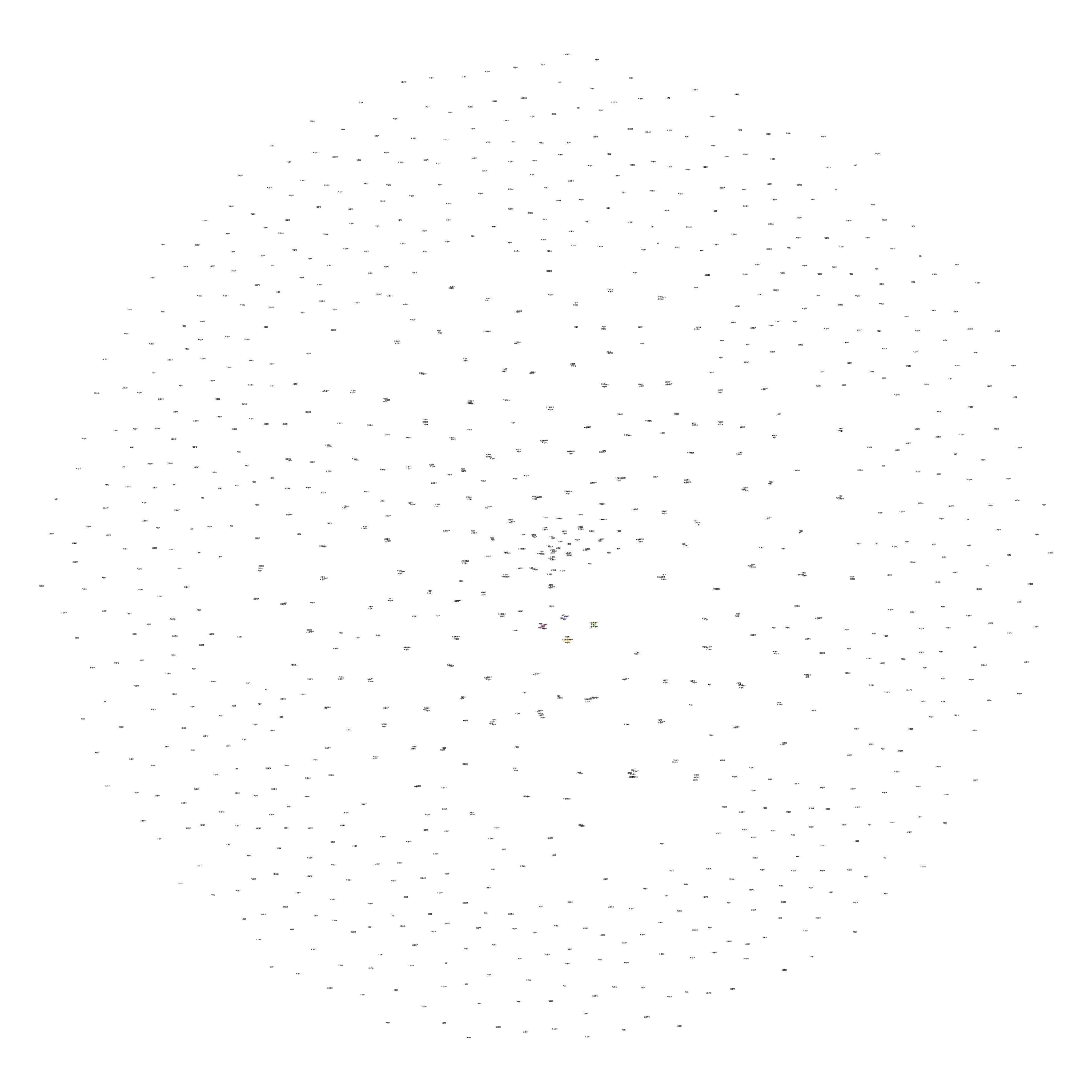
Figure 5.3 shows the full network of SNP locations where at least one mutation occurs where the purple part is the largest connected component.
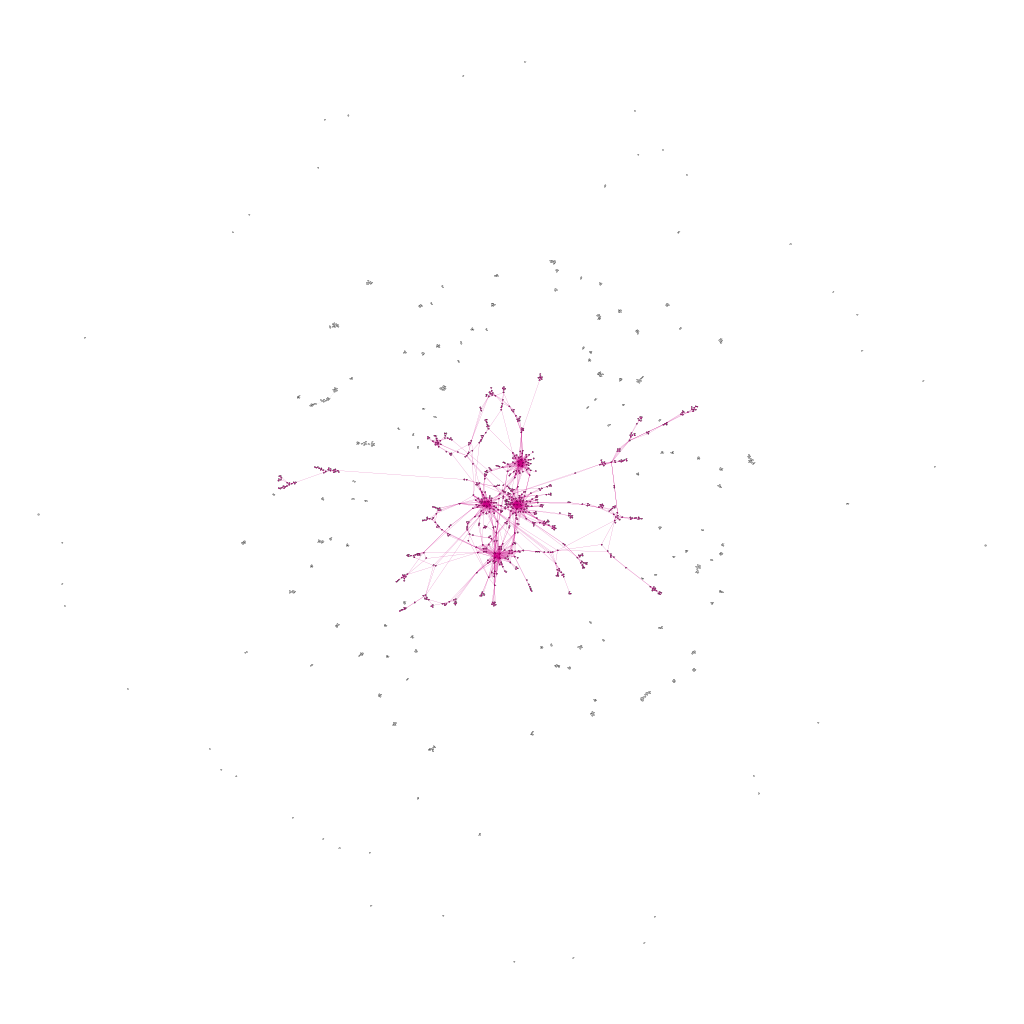 \[\text{Figure 5.3: Figure Full Network of Mutated Genes under Scenario B}\]
Repeating the procedures we took in Chapter 5.3 for Scenario B gives the results below as summarized by Table 5.2:
\[\text{Table 5.2: Number of Components of Size > 3 as a Function of} \;\delta \;\text{under Scenario B}\] The empirical choice \(\delta' = 0.04\) gives the first maximum average number of connected components of size at least 3. Experimenting with \(\delta = 1.5\delta'\) and \(\delta = 2\delta'\) shows that \(\delta = 2\delta'=0.08\) gives a perfect fit.
Figure 5.4 shows the filtered network obtained from Figure 5.3 using \(\delta = 0.08\). Observe that there is no single major connected components. However, all four pathways exist as independent connected components that are colored in Figure 5.4. Figure 5.5 shows the the filtered graph for the four components. All 4 pathways are identified, which supplies proof for the validity of our method.
\[\text{Figure 5.4: Resulted Network using}\; \delta=0.08 \;\text{under Scenario B}\]
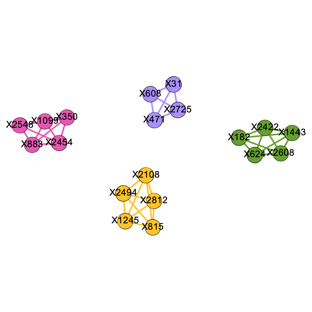
\[\text{Figure 5.5: All 4 Pathways Identified under Scenario B}\]